
ACOSS AND UNSW SYDNEY
INEQUALITY IN AUSTRALIA 2018

ISSN: 1326 7124
ISBN: 0 85871 081 1
Inequality in Australia 2018 is published by the Australian Council of Social Service, in partnership with the University of New South Wales
Locked Bag 4777
Strawberry Hills, NSW 2012
Australia
Email: [email protected]
Website: www.acoss.org.au
© Australian Council of Social Service and University of New South Wales
This publication is copyright. Apart from fair dealing for the purpose of private study, research, criticism or review, as permitted under the Copyright Act, no part may be reproduced by any process without written permission. Enquiries should be directed to the Publications Officer, Australian Council of Social Service. Copies are available from the address above.
About this report: This report is part of a series on Poverty and Inequality in Australia. It is based on research conducted by Peter Saunders, Bruce Bradbury and Melissa Wong at the Social Policy Research Centre of the University of New South Wales, and supplemented with data and analysis from other sources. The main data sources are the Australian Bureau of Statistics (ABS)’s Survey of Income and Housing and the ABS Household Expenditure Survey. For further details on the data and research methods, see Inequality in Australia: New
estimates and recent trends research methodology for 2018 report. The report was drafted by Peter Davidson (NeedtoKnowConsulting), with Peter Saunders (UNSW) and Jacqueline Phillips (ACOSS).
Acknowledgement of Kingsford Legal Centre for Front Cover Photo.
ACOSS Partners


DAVID
MORAWETZ’S
SOCIAL JUSTICE FUND
ACF SUB-FUNDS
- HART LINE
- RAETTVISA
B B & A MILLER FUND


Contents
|
INTRODUCTION |
14 |
|
PART 1: INCOME INEQUALITY |
16 |
|
PART 2: WEALTH INEQUALITY |
20 |
|
Part 1: INCOME |
24 |
|
1.1 The distribution of income today |
25 |
|
1.2 Who sits where in the income distribution? |
33 |
|
1.2.1 How different kinds of households fit within the income spectrum |
36 |
|
1.2.2 Who are the lowest 40% and highest 20%? |
38 |
|
1.3 Trends in income inequality |
40 |
|
Part 2: WEALTH |
48 |
|
2.1 The distribution of wealth today |
51 |
|
2.2 Wealth inequality in Australia compared with other countries |
57 |
|
2.3 Trends in the distribution of wealth |
58 |
Foreword
This report is the first in a new five year partnership between the Australian Council of Social Service (ACOSS) and the University of New South Wales (UNSW) to reduce poverty and inequality in Australia.
The Poverty and Inequality Partnership builds on previous collaboration between ACOSS and the SPRC at UNSW that has already produced a series of reports on poverty and inequality. Our goal is to provide a robust, independent, authoritative research series that regularly monitors the level, nature and trends in poverty and inequality in Australia.
Over the next five years, we will broaden our lens on these issues though examination of the intersection between poverty and inequality and housing, justice and health issues as well as other social outcomes. This will be done through collaboration with UNSW researchers across the university including: Professor Bill Randolph, Professor Hal Pawson and Research Associate Ryan van den Nouwelent from City Futures Research Centre; Professors Mark Harris and Evelyne de Leeuw from the Centre for Primary Health Care and Equity; and Professor Brendan Edgeworth and colleagues from the Faculty of Law.
We gratefully acknowledge the leadership of UNSW President and Vice Chancellor Professor Ian Jacobs along with UNSW Deputy Vice-Chancellor Inclusion and Diversity Professor Eileen Baldry in championing this initiative. We also sincerely thank all the ACOSS partners for their generous support: Anglicare Australia; Australian Red Cross; the Australian Communities Foundation Impact Fund (and two sub-funds- Hart Line and Raettvisa); the BB & A Miller Fund; the Brotherhood of St Laurence; CoHealth; the David Morawetz Social Justice Fund; Good Shepherd Australia New Zealand; Mission Australia; the St Vincent de Paul Society; the Salvation Army; and the Smith Family.
This report shines a light on inequalities in income and wealth in Australia using the latest available data from the Australian Bureau of Statistics. It tells us that the gap between those with the highest and lowest incomes in Australia is unacceptably large – a person in the highest 20% lives in a household with five times as much disposable income as someone in the lowest 20%. It also tells us that incomes are very concentrated, with the top 20% collectively receiving 40% of all household income, more than the lowest 60% combined. Wealth is even more unequally distributed. The average wealth of a household in the highest 20% is 100 times that of the lowest 20%.
The report shines a light on the faces of economic inequality – who is most likely to be left behind or getting ahead. While the level of income inequality has plateaued since the Global Financial Crisis, wealth inequality has continued to grow. We share a concern that the income gap will continue to widen once stronger economic growth resumes. We also share the belief that this is not inevitable and that tax, transfer, labour market and education policies can and must play a more effective role in reducing divisions in our community.
We hope that this report and the broader poverty and inequality research series informs policy debate and inspires reform to create a more inclusive and equitable Australia.
Dr Cassandra Goldie Professor Peter Saunders


Photo credit: Kingsford Legal Centre
Key terms
|
After tax income |
Income from all sources after income tax, the Medicare Levy and the Medicare Levy surcharge are deducted. Also known as net or disposable income. See definition of income below. |
|
ABS |
Australian Bureau of Statistics |
|
Before tax income |
Income from all sources, before income tax, the Medicare Levy and the Medicare Levy surcharge are deducted. Also known as gross income. |
|
CPI |
Consumer Price Index |
|
Equivalisation |
A method of standardising the income of households to take account of differences in household size and composition. For further information see Inequality in Australia: New estimates and recent trends research methodology for 2018 report |
|
FTB |
Family Tax Benefit |
|
GDP |
Gross Domestic Product |
|
GFC |
Global Financial Crisis |
|
Gini coefficient |
A summary measure of inequality. A Gini coefficient of 0 represents perfect equality (every person has the same income or wealth), while a coefficient of 1 implies perfect inequality (one person has all income or wealth). The closer the Gini coefficient is to zero, the more equal the distribution; the closer to 1, the more unequal. |
|
GST |
Goods and Services Tax |
|
Household |
A person living alone or a group of related or unrelated people who live in the same private dwelling. |
|
Income |
Income includes receipts from:
|
|
Quintile |
Groupings that result from ranking households by the level of economic resources (income or wealth) and then dividing the population into five equal groups. Smaller groups can be similarly defined to cover the highest (or lowest) 10 per cent or 5 per cent, based on their levels of income or wealth. |
|
Net Wealth |
The value of a households total assets less its liabilities. Also known as ‘net worth’. Wealth includes:
Less, credit card debt and student loans. |
|
NSA |
Newstart Allowance |
|
PPS |
Parenting Payment Single |
|
RA |
Rent Assistance |
|
YA |
Youth Allowance |
Figures
|
FIGURES |
|
|
17 |
|
18 |
|
20 |
|
22 |
|
28 |
|
29 |
|
31 |
|
36 |
|
37 |
|
42 |
|
43 |
|
44 |
|
45 |
|
46 |
|
50 |
|
52 |
|
52 |
|
53 |
|
54 |
|
55 |
|
56 |
|
57 |
|
60 |
|
61 |
|
61 |
|
62 |
|
63 |
|
64 |
|
66 |
|
TABLES |
|
|
27 |
|
30 |
|
39 |
Introduction
Excessive inequality in any society is harmful. When people with low incomes and wealth are left behind, they struggle to reach a socially acceptable living standard and to participate in society. These are Australia’s real ‘battlers’. When a minority of people accumulate income and wealth well above the rest of the population, this can lead to excessive concentration of power that becomes self-perpetuating, fraying the bonds of social cohesion and trust. Australia prides itself on its egalitarian traditions, where the extremes of neither poverty1 nor affluence (a ‘bunyip aristocracy’)2 are acceptable.
Too much inequality is also bad for the economy. When resources and power are concentrated in fewer hands, or people are too impoverished to participate effectively in the paid workforce, or acquire the skills to do so, economic growth is diminished. The Organisation for Economic Cooperation and Development (OECD) estimates that rising income inequality has reduced economic growth by an average of around 5 per cent across OECD countries over the two decades to 20103.
There will always be debate over how much inequality is ‘too much’. What is not in doubt is that in most wealthy nations, inequality of income and wealth has increased substantially since the early 1980s. The OECD reports that on average in wealthy countries in 2015, the 10% of people with the most income received 9.6 times the income of the 10% with the lowest incomes. In the 1980s, that ratio stood at 7:1, rising to 8:1 in the 1990s and to 9:1 in the 2000s4
The purpose of this report is to provide a factual underpinning to the debate about inequality in Australia, rather than to advocate policies to reduce it. We lay out, as simply and clearly as possible, the latest information on the incomes and asset holdings of people at the upper, middle and lower rungs of the ladder of economic prosperity, and who sits on each rung. We map trends in income inequality from 1999 to 2016, and in wealth inequality from 2003 to 2016 (based on the years for which reliable, comparable data is available), and point to some likely explanations for these. We also compare Australia’s experience with other countries who are members of the OECD.
The changes being experienced in Australia (as elsewhere) have the potential to fundamentally change the nature of our society, who benefits from our economy, and how. This change needs to be understood and debated if we are to plot our own destiny for the benefit of all people, and this report contributes to these tasks.
1 The report of the national inquiry into poverty established by the McMahon government in 1971 commenced with these words: ‘The elimination of poverty should be a vital national goal’ (Commission of inquiry into poverty (1975): ‘First main report’, introduction).
2 The term ‘bunyip aristocracy’ became a common term of derision when it was used to refute the proposal of a hereditary peerage for the colony of NSW. See: http://www.oxfordreference.com/view/10.1093/oi/authority.20110803095535679
3 OECD (2015) In it together: Why less inequality benefits all OECD, Paris.
4 Ibid.

Part 1: Income Inequality
Income equality in 2016
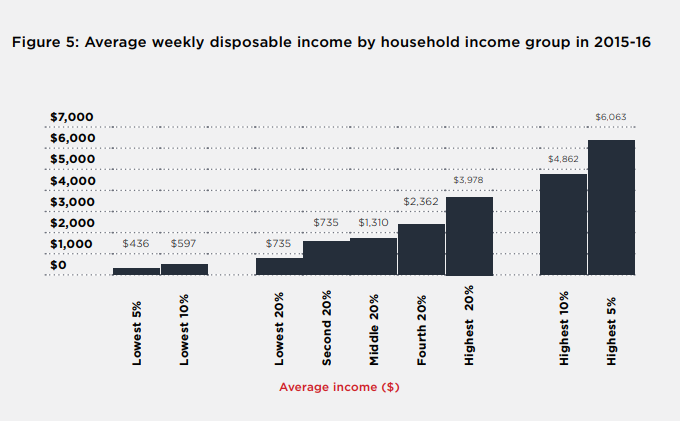
The reality of income inequality in Australia will come as a shock to many. A person in the highest 20% income group lives in a household with five times as much disposable (after tax) income as someone in the lowest 20% ($3,978 per week on average in 2016, compared with $735 per week). At the more extreme ends of the scale, people in the highest 1% live in households that have an average weekly disposable income of $11,682 per week, 26 times the income of a person in the lowest 5% ($436). This means the highest 1% earns as much in a fortnight as the lowest 5% receives in a year.
A focus on the very top of the distribution can obscure income gaps further down the ladder. Many people in households well above the average disposable income of the middle 20% ($1,779 per week) would be surprised to learn they may not be (statistically speaking) part of ‘middle Australia’. A couple with two full-time average wages ($3,240, twice $1,620 per week before tax) are most likely to belong to the second-highest 20%, whose average household income before tax is $2,900 per week.
The highest 20% (with average weekly disposable income of $3,978) collectively receives 40% of all household income, more than the lowest 60% combined. They include many double-income professional families who are unlikely to regard themselves as high income-earners.
Attention here and internationally is increasingly turning to how people fare on the lower rungs of the income ladder, especially the lowest 40% (about one third of whom live below the poverty line)26. When we compare this group with the rest of the community, stark divides emerge between people with secure jobs and homes, and those who lack both.
The average weekly disposable (after-tax) income of the lowest 20% is $735 and that of the lowest 5% is $436. Only 26% of people in the lowest 20% are in households whose main income is earnings. While 62% of the second-lowest 20% are in households mainly relying on wages, those earnings are likely to be well below the average full-time wage since half of all wage-earners (including part-time workers) earned less than $1,056 (median earnings, before tax) a week (before tax) in 2016.

Note: The population is divided into five main ‘income groups’ of equal size (quintiles), comprising individuals in households with different levels of disposable income (adjusted to take account of household size).
Faces of income inequality
We gain a much better understanding of the impact of inequality, and who is affected, if we put faces to the statistics.
Most (60%) of the lowest 20% are in households that rely mainly on social security for their income, of which the largest group (51%) receives Age Pensions. Among social security recipients with the lowest incomes (in the lowest 5%), nearly half (47%) receive Newstart Allowance, which was $270 a week for a single adult in March 2016.
Among those who are over-represented in the lowest 20% of households by income are sole parents (36% of whom are in this income group), over 65s (39%), people who are unemployed (77%), people born in non-English speaking countries (24%), and people living outside capital cities in South Australia, Tasmania, Victoria or New South Wales (over 25% in all cases).
Among those over-represented in the highest 20% are people of working-age (26%), couples without children (26%), those in households with at least one full-time paid worker (29%), and those living in Sydney, Perth, the Australian Capital Territory or Northern Territory (all over 25%).
How we compare on income inequality
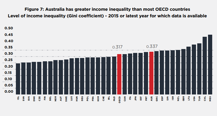
Australia’s level of income is more unequal than the OECD average, but more equal than other major English-speaking countries including the United States and United Kingdom, which have very high levels of inequality. Australia’s Gini coefficient (an inequality measure where zero means complete equality and one means complete inequality) is 0.34, compared with an OECD average value of 0.3227.
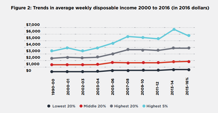
Trends in income equality since the turn of the century (2000 to 2016)
On the back of steady increases between 1981 and 2000, income inequality continued rising between 2000 and 2008, reaching a peak during the Global Financial Crisis (GFC) in 2007-08, since when it has plateaued28.
This means that although inequality now is no higher than in 2007-08, it is higher than in any year between 2000 and 2008, and almost certainly higher than in any year between 1981 and 2008.
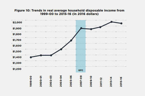
During the boom period from 2000 to 2008, average household disposable income grew by a remarkable 4.3% per year in real terms (after inflation). However, income growth was very uneven: the average income of the lowest 20% grew by 5.6% per year, compared with 5.9% for the middle 20%, 7.2% for the highest 20%, and 10.3% for the highest 5%.
After the GFC, from 2008 to 2016, real average household income grew by a sluggish 0.5% per year but income growth of the lowest 20% was 2.5% per year, compared with 0.3% for the middle 20%, 0.8% for the highest 20%, while that of the highest 5% declined by 0.6% – the latter most likely due to declining income from superannuation and investment assets.
Causes of higher income inequality
Key factors contributing to the rise in inequality from 2000 to 2008 include strong but unequal growth in wages and investment incomes, and a succession of income tax cuts in the mid-2000s which mostly benefited those on higher incomes. The impact of these factors was mitigated to an extent by falling unemployment. Key factors reducing inequality since 2008 include declines in most investment returns (apart from an investment housing boom) and a large increase in the payment rate of pensions. Other social security changes, including the diversion of many sole parents and people with disabilities from pensions to Newstart Allowance, and cuts to family payments, increased inequality.
Underpinning these trends across the whole period were inconsistent social security policies such as freezing Newstart Allowance and family payments while indexing pensions to earnings growth, a long-term trend towards greater inequality in hourly wage rates, and growing inequality in the distribution of wealth (see below), which generally increases inequality in investment income29.
These underlying trends are likely to reassert themselves and increase inequality once stronger economic growth is restored. This is not inevitable: social security, tax, education, minimum wage and labour market policies all affect the way the fruits of economic growth are distributed across the community.
Over the last two decades, the role of government in reducing income inequality has diminished, due to a combination of economic factors and policy changes30. Solid employment growth up to 2007 reduced reliance on income support, while the indexation of Newstart, related Allowance payments and family payments to the Consumer Price Index (CPI) only (rather than to earnings, like pensions) diminished their impact on reducing inequality and poverty. On the tax side, eight successive income tax cuts during the mid-2000s reduced the impact of our main progressive tax.
5 United Nations (2017): Social development goals report. Available: https://unstats.un.org/sdgs/files/report/2017/TheSustainableDevelopmentGoalsReport2017.pdf In 2014, 13.3% of people were in households below the poverty line (ACOSS 2016: Poverty in Australia) Note that these two groups are not identical, because we measure poverty differently (taking account of housing costs).
6 OECD Income Distribution Database. Available: http://www.oecd.org/social/income-distribution-database.html
7 The summary measure of income inequality used here is the Gini coefficient. Based on the Australian Bureau of Statistics (ABS) weekly income measure this rose from 0.304 in 1999-00 to 0.319 in 2007-08, then declined to 0.305 in 2015-16. When the ABS annual income measure is used, the Gini rose more sharply from 0.304 in 1999-00 to 0.344 in 2006-07, and declined to 0.329 in 2014-15. Looking further back in time, Whiteford (2015) estimated that the Gini rose from 0.27 in 1981 to 0.31 in 2001 (Whiteford, P (2015): ‘Inequality and its socio-economic impacts,’ Australian Economic Review Vol 48 No 1, pp83-92).
8 Borland J & Coelli (2016): ‘Labour market inequality in Australia’ Economic Record, Vol 92, No 299, pp 517–547; Whiteford, P (2013): Australia: Inequality and prosperity and their impacts in a radical welfare state Crawford School of Government, Australian National University.
9 Greenville J (2013): Trends in the distribution of income in Australia, Productivity Commission, Canberra; Whiteford P (2013), op cit.
Part 2: Wealth inequality
Wealth inequality in 2016
Wealth is the key to many life opportunities. It can boost income, and sustain it when people are unable to continue paid work (especially after retirement), by generating investment returns. Because wealth largely accrues from past income, and contributes to future income, high levels of wealth inequality can deepen and entrench overall inequality of material resources.
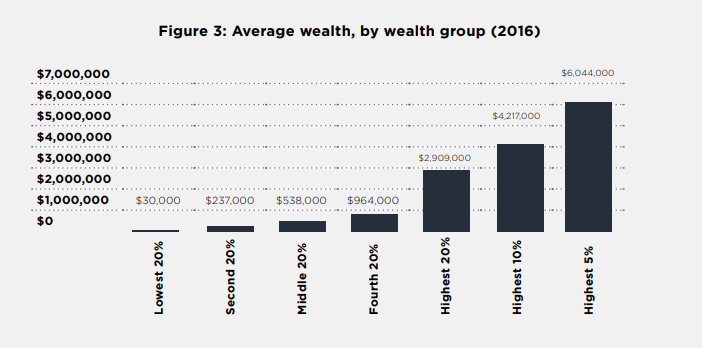
Australia’s average net wealth per household is $936,000, of which 39% is held in the main home, 20% in superannuation, 19% in shares and other financial assets, 12% in investment real estate, and 10% in other non-financial assets such as cars10. The high average figure for asset holdings is due in part to the substantial wealth of a wealthy minority11. For example, in 2017, there were 3,000 Australians with $US50 million or more. In contrast, the average wealth holdings of the middle 20% of households is much lower, at $537,000.
Wealth holdings are much more concentrated than income. The highest 20% of households by wealth own 62% of all wealth, while the lowest 50% own just 18%. The average wealth of a household in the highest 20% wealth group ($2.9 million) is five times that of the middle 20% ($570,000) and almost a hundred times that of the lowest 20% ($30,000). The wealthiest 5% had average wealth of $6 million and the wealth of the highest 1% averaged $14 million.
Ownership of some asset classes is even more concentrated. The highest 20% of the wealth-holders own over 80% of all wealth in investment properties and shares and over 60% of all superannuation assets. In contrast, they own 54% of all wealth in family homes.
Wealth holdings across income groups are more evenly distributed, largely due to high levels of home ownership among retired people, many of whom have relatively low incomes. The highest 20% of households by income had average wealth of $1,952,000, almost three times the middle 20% ($711,000) and almost four times the lowest 20% ($532,000). The highest 5% had an average of $3,730,000.
How we compare
Australian households are wealthy by world standards. In 2016 we had the second-highest average wealth per adult (at $US376,000) in the world after Switzerland, with a relatively high share held in real estate12..27
In contrast, and on some measures, wealth is more equally distributed here than in most other OECD countries. In 2013-14, the top 10% of wealth holders in Australia had the eighth-lowest wealth share (46% of all household wealth) among the 22 countries for which data are available. Conversely, the lowest 60% of Australian households held 17% of all household wealth, the eighth-highest share.
However, wealth inequality in Australia is increasing.
11 Credit Suisse Research Institute (2017): Global wealth report Zurich.
12 Credit Suisse Research Institute (2016, 2017): Global wealth report, 2016 and Global wealth report, 2017. Zurich.. Note that this is a different statistic (wealth per adult) than the household wealth data used in this report.
Trends in income inequality (2000 to 2016)
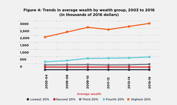
In the ABS surveys, consistent data for mapping wealth inequality are only available from 2004 to 2016. Average household wealth rose strongly from $644,000 in 2003 to $836,000 in 2009, fell to $802,000 in 2011 (after the GFC), and rose again to $936,000 in 2016.
The fastest-growing asset classes by value were superannuation (which grew by 119% after inflation adjustment) and investment property (61%), reflecting regular contributions and generous tax treatment for superannuation and a property boom, respectively. Since these assets also became more concentrated at the top of the wealth distribution, they were the main contributors to growth in wealth inequality over the period.
Over the 12 years to 2016, wealth inequality increased, though (as with income inequality) there was some levelling off after the GFC in 2008. The Gini coefficient for household wealth rose from 0.57 in 2003 to 0.60 in 2009, fell to 0.59 in 2011, and then rose again to 0.61 in 2015.
The average wealth of the highest 20% rose by 53% after inflation adjustment (to $2.9 million) from 2003 to 2016, while that of the middle 20% rose by 32% and that of the lowest 20% declined by 9%. The wealth of the highest 5% grew even more rapidly, by 60% over this 12-year period.
The faces of wealth inequality
Household wealth shifted from younger to older age groups from 2004 to 2016 The average wealth of households with a reference person aged over 64 years grew by 57% from 2004 to 2016 (to $1.3 million) and by 36% (to $1.2 million) for those with a main reference person aged 45-6, compared with 28% (to $700,000) for 35-44 year old people and just 22% (to $300,000) for those under 35.
The average holdings of owner-occupied housing among the under-35 group (net of mortgage debt) declined from $90,000 to $85,000. In contrast, the average for households with a reference person aged 65 or over rose by 37% from $402,000 to $509,000. This reflects the growing difficulties many younger people face in raising the funds to purchase their first home13. 26
Wealth inequality increased most strongly between people under 35 years14.27That is, the divide between wealthier and less wealthy younger people grew in the period. This was mainly due to rapid growth in the average value of shares, financial and business assets and investment property held by younger households, and the concentration of these assets in wealthier, younger households.
13 From 1981 to 2011, the home ownership rate among 25 to 34 year-olds fell from 61% to 47% (Yates J (2015): Trends in home ownership: causes, consequences and solutions Submission to the Senate Standing Committee on Economics Inquiry into Home Ownership,’ University of Sydney).
14 The Gini coefficient for the distribution of wealth within households whose reference group is that rose from 0.58 to 0.65 (compared to 0.57 to 0.61 for all households).

PART 1: INCOME
INCOME
Income is the most commonly used basis for measuring economic wellbeing. Income can be used to purchase goods and services to meet basic needs such as food, clothing, and housing, as well as to supply things that enhance quality of life, such as recreational activities. For most people, income also determines how much they pay in tax and how much they receive in social security benefits. In this chapter we look at the distribution of income today, who sits where in the distribution of income, and trends in income inequality between 1999 and 2016.
Chapter 1 of the Supplementary Report dissects the main components of private income (such as earnings and investment income) and the impact of government (especially social security payments and income tax) on disposable income, in order to better understand the causes of income inequality.
Chapter 2 of the Supplementary Report maps the location of different groups on the income ladder.
1.1 The distribution of income today
Key points
Income in Australia is more unequal than the OECD average, but more equal than most other major English-speaking countries including the United States or United Kingdom, which are the most unequal among the wealthier OECD nations.
Inequality comes into sharp relief when we compare incomes at the top and bottom of the income ladder. A person in the highest 20% lives in a household with five times as much disposable income as someone in the lowest 20% ($3,978 per week on average in 2016, compared with $735).
The highest 5% (with $6,063 per week on average) has eight times the disposable income of the lowest 20% ($735 per week) and almost fourteen times as much as the lowest 5% ($436).
The highest 1% receives as much in a fortnight ($23,400 in disposable income) as the lowest 5% receives in a year.
The highest 20% has 40% of all household disposable income, more than the lowest 60% combined.
The average pre-tax income of the middle 20% is $2,100 per week, which in 2016 was equal to 1.3 average full-time earnings. A couple with two full-time average earnings (twice $1,620 per week before tax in 2016, or $3,240) are more likely to belong to the second-highest 20%, whose average total household income before tax is $2,900 per week.
How inequality is presented
in this report
In this report, we use the household as our unit of analysis, because households typically share income and expenses among household members. However, household income is equivalised to reflect the number of people in the household (see below) and is assumed to be distributed equitably (according to need), so that each person in the household has the same level of adjusted income, or well-being.
The number of people in a household, and the age of those people, can make a significant difference to the demands on the income received by that household. This report takes account of the size and composition of a household when looking at where it sits in the national distribution of income – this is called equivalisation. Equivalisation adjusts the incomes of larger households downwards to take account of two aspects:
- The number of people in the household: the more people who are in a household, the more income is required to achieve a given level of well-being; and
- Economies of scale: While more income is required for a household with a higher number of people, there are also economies of scale some items (e.g. housing; furniture) that allow a given income to go further in meeting household needs when more than one person lives there.
We use equivalised household disposable income to rank households into groups according to their incomes, but for ease of understanding, the average incomes reported for each group are not equivalised. Three ‘layers’ of income are presented: private income (such as earnings and investment income), gross income (private income plus social security payments) and disposable income (gross income minus personal income tax).
We break the population up into five even groups (or quintiles), calculate the share of total income going to each group and look at the income (or wealth) characteristics of each household. This means, for example, we look at the 20% of the population who are in households with the highest incomes compared with the 20% in households with the lowest incomes. To show what is happening at extreme ends of the distribution, we also present data on the household incomes of the highest and lowest 10% and 5% of the population, together with analysis of the highest 1%.
We also look at the characteristics of people at different points along the income spectrum (based on the income of their household). For example, we look at whether people who are employed, unemployed, single, over the age of 64 or from a non-English speaking background are more likely to be in low, middle or high-income households
Other measures of inequality used in this report include the shares of all household income received by each household group and the Gini coefficient. If income is equally divided the share of each 20% group would be 20% and the Gini coefficient would be equal to 1.
A fuller discussion of the equivalisation methodology and other technical aspects of the analysis underlying this report is contained in Inequality in Australia: New estimates and recent trends: Research methodology for 2018 report
Table 1 below allows the reader to see roughly where their household fits in the overall income distribution ranking. (See page 32 to compare your income.) This provides a more nuanced picture of income inequality than single figure measures such as the Gini coefficient. Note the incomes presented here are averages for all households within each group.
The top 20% of households have five times the disposable income of the lowest 20%
There are sharp differences between average incomes of low, middle and high-income households in Australia. Table 1 shows that:
- A person in the highest 20% group lives in a household with more than twice the average disposable income of the middle 20% ($3,978 per week compared with $1,779), and five times as much disposable income of a household in the lowest 20% ($735 per week).
- The average income of the middle 20% ($1,779 a week) is two and half times that of the lowest 20% ($735).
- Income is heavily concentrated at the top: average income in the highest 5% (at $6,063) is more than one-and-a-half times the average of the highest 20%, and the average of the top 1% (at $11,682) is almost three times that of the highest 20%.
- The average disposable income of the highest 1% ($11,682 per week) is more than 26 times that of the bottom 5% ($436). This means that the highest 1% receives as much income after tax in a fortnight as the lowest 5% receives in a year.
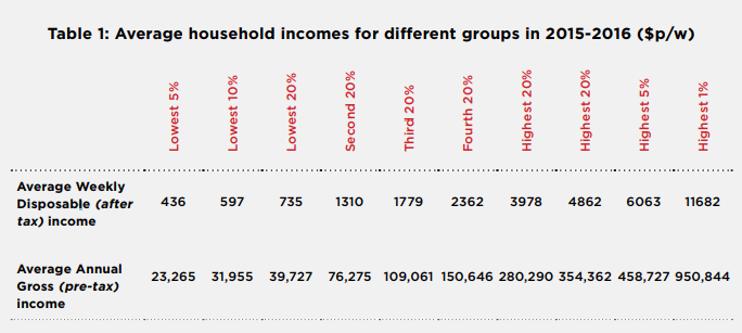
Figure 5 compares the average weekly disposable incomes of different income groups (the same as the top row of Table 1).
The middle is not where many people think it is
Many people in high-income households wrongly assume they sit in the middle of the income distribution because their earnings are close to ‘average’. If we multiply average full-time total earnings in 2016 by two (assuming typical middle-income households have two wages), that gives us a weekly household income before tax of $3,240. Yet this is above the average income of the second-highest 20% ($2,900 per week) and well above that of the middle 20% ($2,100)15.26
Average fulltime earnings can give a misleading impression of people’s position in the overall income ladder for the following reasons:
Confusion between ‘average’ and ‘middle’ incomes:
- Average full-time earnings ($1,620 per week before tax in 2016) are lifted by those of a minority of highly-paid workers, whereas the ‘median’ full-time wage (which sits exactly between the highest and lowest wages, splitting the distribution into two equal halves) is much lower ($1,400 per week before tax).
- Average full-time pay excludes part-time earnings (including those earned by the majority of women, who are in part-time paid jobs). The median income for all wage-earners in 2016 was $1,060 per week before tax.
- Average full-time pay also neglects those households (a majority of the lowest 20%) that do not have wages as their main source of income. They include most recipients of the Age Pension and other social security payments such as Newstart Allowance for people unable to secure paid work.
- Assuming that the household has two earned incomes also neglects the fact that many people (16% of adults) live in single person or sole parent households.
The highest 20% received as much income as the lowest 60% combined
Another way to compare incomes is to calculate how overall household income for all people is shared among different groups. In 2016, people in the highest 20% income group received 40% of all household income, which was more than the share received by the lowest 60% combined (who received 38%). People in the lowest 20% (most of whom received social security as their main income source) received only 8% of all household income, while the second lowest 20% (most of whom had a low wage as their main income source), received 13% (Figure 6).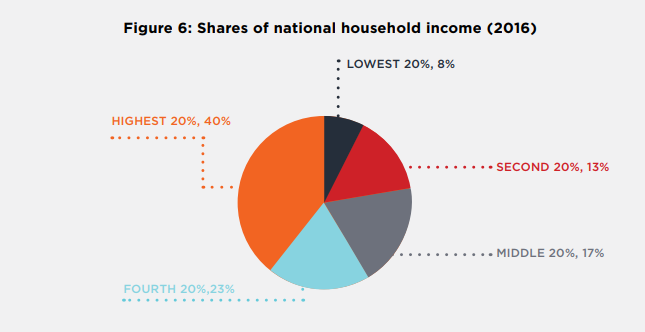
The hare and the tortoise: the top 1% and the lowest 40%
The average income of the top 1% is ten times that of the lowest 40%
Much of the recent debate about inequality, in Australia and globally, has focused on the share of income and wealth going to the ‘very rich’ – those in the highest 1%16.27 Concerns have been raised about the potential implications of greater concentration of income at the very top of the distribution, include rent-seeking behaviour and political and economic capture by an economic elite17.28
15 The average full-time total wage in May 2016 was $84,400 per year ($1,620 per week), before tax. The following data on median and average incomes are from Australian Bureau of Statistics (2016): Employee Earnings and Hours, Australia, Cat No. 6306. See also Australian Bureau of Statistics (2017): Labour Force Status and Other Characteristics of Families (Cat. No. 6224).
16 Piketty T (2015):Capital in the Twenty-first Century Harvard University Press; OECD (2015) Op citLeigh A (2012): Why inequality matters, and what we should do about it Presentation to Sydney Institute, 1 May 2012,available: http://www.andrewleigh.com/2521 ; Stiglitz, J (2012): ‘The price of inequality: How today’s divided society endangers our future Norton, USA.
17 OECD (2015) Op cit; See also Alvaredo, F et al (2018): World inequality report available: http://wir2018.wid.world/
As in other OECD countries, a large share of the benefits of recent economic growth in Australia has accrued to this group. Estimates suggest that the highest 1% in Australia captured more than 20% of the pre-tax growth in income between 1975 and the onset of the Global Financial Crisis in 200718.26
In 2016, average disposable income for the 229,000 individuals in the highest 1% of households was $11,700 per week (Table 2). This is over ten times the average disposable income of the lowest 40% ($1,022).Their incomes were almost twice that of the highest 5% and almost six times the overall average household disposable income ($2,033).
They also grew more rapidly. From 2000 to 2016, their average incomes rose 15% faster than the highest 5% and 52% faster than average.
Table 2: Weekly disposable incomes of the highest 1% and 5% of
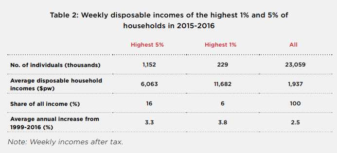
The rest of this report focuses on the highest 5% incomes rather than the highest 1% because the number of individuals responding to the ABS survey who fell within the highest 5% is much larger, reducing the risk that small sample size may bias the results. Another challenge in estimating incomes for very high earners from surveys is the greater likelihood that they will either decline to participate, or that their income will be understated19.27
The lowest 40% income group rely mainly on social security or (low) wages
When assessing the impact of income inequality on social equity and economic growth, it is important to focus also on the relative well-being of those in the lowest 40% income group, who face the greatest risks of poverty, poor health, and childhood disadvantage20.28 Further, opportunities for people with low incomes to engage in education, improve their skills and participate socially and economically are especially crucial to economic growth and development21.29
The lowest 40% income group comprises households whose main income is social security or low full-time or part-time earnings. Their average disposable income is $1,022 per week, less than one tenth of that of the highest 1%. In the lowest 20%, the main income source is social security (especially the Age Pension), while in second-lowest the main income source is earnings.
The lowest 5% income group includes a mix of households relying on social security as their main income source (49%), earnings (21%), investments (19%) and own business income (11%). Among households where the reference person receives a social security income support payment, 47% receive Newstart Allowance, which is one of the lowest payments22.30
Australia has higher inequality than most other wealthy nations
Figure 7 shows that income inequality in Australia was higher than the OECD average in 2015 (the latest year for which comparative date is available). In the OECD income inequality rankings, Australia sits with between other English-speaking countries (above Canada but below the United States and the United Kingdom) and alongside some countries with lower income levels (such as Greece and Portugal). Most European countries had substantially lower inequality than Australia.
Here income inequality is compared using the Gini coefficient. The higher the Gini, the greater the degree of inequality or concentration of income.
By comparison, among the lowest 10%, 57% have social security as their main income source (higher than for the bottom 5% due to a lower share of people with income from investments and self employment) but only 27% of household reference persons received Newstart Allowance (due to a higher share of people receiving pensions). As discussed, the ABS has concerns about under-reporting of income in the lowest 2%, especially among households whose main income is self-employment or investments. More detailed findings are presented in Chapter 2 of the Supplementary report. Source: Source: OECD Income Distribution Database (IDD), http://stats.oecd.org/Index.aspx?DataSetCode=IDD
Measuring inequality with the Gini coefficient
A Gini coefficient of 0 represents perfect equality (every person has the same income), while a coefficient of 1 implies perfect inequality (one person has all income). In general, the closer to zero, the more equal the income distribution, the closer to 1, the more unequal. This single measure is useful for international comparisons, but it has limitations when it comes to describing the shape of the income distribution (for example whether there is more inequality between low and middle-income households or between middle and high-income households) and explaining the main causes of inequality. For those purposes, we need more detailed information on how income is shared across different groups in the population.
Compare your income
You can use this interactive tool produced by the OECD to compare your income
with those of others across Australia: http://www.compareyourincome.org/
1.2 Who sits where in the income distribution?
There are two ways to show how people from different segments of the population (for example, sole parent families) are faring, distributionally: first, by finding out who belongs to each income group (e.g. what proportion of the lowest 20% are sole parent families), and secondly, by finding out how each segment is apportioned across income groups (e.g. what proportion of sole parent families are in the lowest 20%).
Some key findings using both approaches are presented here.23
Key points
What is the main income source of households in each income group?
- Most people in the lowest 20% income group (60%) are in households that rely mainly on social security for their income, of which the largest group (51%) are in households whose reference person receives the Age Pension. Among social security recipients with the lowest incomes (those in the lowest 5% income group), 47% are in households in which the reference person receives the Newstart Allowance, which in 2016 was $270 a week for a single adult.
- As we move up the income ladder, a growing share of income comes from earnings. Among people in the second 20% income group, 62% live in households in which the main income is earnings. Among household reference persons in this income group, 50% are employed full-time and 20% are employed part-time.
- Of those in the highest 20% income group, 87% live in households where earnings are the main income source, and 87% of the reference persons of these households are employed full-time. An above-average share of the highest 20% households has investment income as their main source of income (9% compared with 8% overall).
How are different segments of the population divided into income groups?
- People more likely to be in the lowest 20% of households by income include sole parents (36% of whom are in this income group), people aged over 65 years (39%), people who are unemployed (77%), people born in non-English speaking countries (24%), and people living outside capital cities in South Australia, Tasmania, Victoria, or New South Wales (over 25% in all cases).
- Those more likely to be in the highest 20% include people of working-age (26%), couples without children (26%), those in households with a reference person employed in full-time paid work (29%), and those living in Sydney, Perth, the Australian Capital Territory or Northern Territory (all over 25%).
Note: More detailed findings are presented in Chapter 2 of the Supplementary report.
Attention now focuses on identifying the characteristics of households at different points along the income spectrum. We do this in two ways.
First, we show where different groups (such as different types of families) sit in the income distribution: for example, we look at the proportion of sole parent families who fall within each of the 20% income groups, showing they are more likely to be in the lower than the higher groups.
Second, we show the profile of each group along the income spectrum: for example, the proportion of households in the lowest 20% who are sole parent families.
These two perspectives yield different results. For example, while almost half (40%) of sole parent families are in the lowest 20% of the distribution, because sole parent families are only a small part of the overall population (7%) they compose only 12% of all families in the lowest 20%.
Chapter 2 of our Supplementary Report provides detailed breakdowns of the distribution of individuals across different household income groups according to age, gender, family type, labour force status of the highest income-earner in the household, the main income source of the household, receipt of income support payments, and State or Territory of residence.

1.2.1 How different kinds of households fit within the income spectrum
Older people, single people and sole parents, and those who mainly rely on social security are more likely to be in to the lowest 20%
Those more likely to be in the lowest 20% include people over 64 years of age and sole parent families, due partly due to their lower employment levels and caring responsibilities, and partly to the level of social security payments (Figure 8)24.26
The most important influence on incomes is labour force status. People living in households where the household reference person is not in the labour force or is unemployed are much more likely to be in the lowest 20%, along with other households dependant on an income support payment.
People living in Tasmania and South Australia are also more likely to be in the lowest 20%, along with people living outside capital cities.
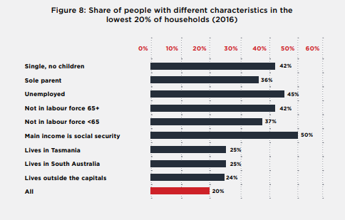
Note: Share of each group (e.g. sole parents) who are in lowest 20% of households.
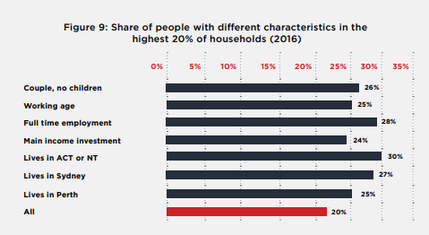
Full-time employees, people with investments as their main income source, and couples without children are more likely to be in the highest 20%
By contrast those more likely to be in the highest 20% are of working-age and in couple households without children (recalling that income is adjusted to take account of the costs of children through the equivalence adjustment). People employed full-time are more likely to be in the highest 20%, along with those whose main income comes from investments. People living in Sydney, Perth, the ACT or NT are also more likely to be in the highest 20% (Figure 9).
24 Whiteford P & Adema W (2007): What Works Best in Reducing Child Poverty: A Benefit or Work Strategy? OECD, Paris. Available: http://www.oecd.org/dataoecd/30/44/38227981.pdf
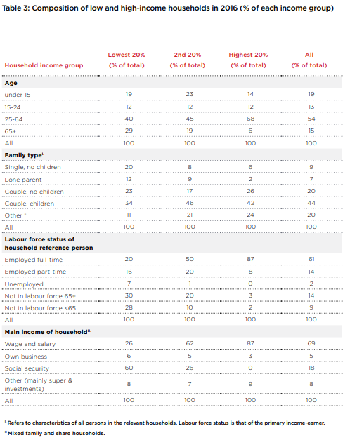
1.2.2 Who are the lowest 40% and highest 20%?
We turn now to the composition of the lowest and highest income groups: the lowest 40% and highest 20% (Table 3)25.26The composition of all income groups is detailed in Chapter 2 of the Supplementary Report.
Most of the lowest 20% rely mainly on social security and only a minority have paid employment
In the lowest 20% of households, the highest income-earner is not in the labour force in 58% of households, compared with 23% in all households. Similarly, the main income source is social security in 60% of in these households, compared with just 18% of all households. Since older people are a minority of the population overall, these households are more likely to be of working age (40%) than over 64 years (29%). In these households, 32% are either single individuals or sole parents, compared with 16% of all households; and 34% are couples with children, compared with 44% of all households).
Most of the next 20% rely on wages as their main income but over a quarter rely mainly on social security
Compared with the lowest 20%, the profile of the second 20% income group contains more households with children and young people (35%), and fewer older people (19%). Two-parent households with children (46%) are more often found in this group. Significantly, it contains many full-time (50%) and part-time (20%) earners, so that 60% of households have wages as their main income source, compared with 26% who rely mainly on social security (mainly recipients of the Age Pension).
Most of the highest 20% are couples of working age in fulltime paid employment.
The profile of the highest income group is dominated by people of working age, 68% compared with 54% in all households; couples with or without children, 68% compared with 64% in all households; earners employed full-time, 87% compared with 61% of all households; and those whose main income source is earnings from employment, 87% compared with 69% of all households. No households in the highest income group have social security as their main source of income.
25 The lowest 40% is a commonly-used benchmark of low income. See for example United Nations (2017): Op citThe Sustainable Development Goals include raising the income share of the lowest 0% in all countries by 2030.
Table 3: Composition of low and high-income households in 2016 (% of each income group)
1.3 Trends in income inequality
In this section, we examine trends in income inequality from 1999-00 to 2015-16, breaking the period down into two eight-year segments before and after the GFC in 2007-0826.
26 Inequality in Australia: New estimates and recent trends research methodology for 2018 report outlines the approach taken to improving consistency in the income measures used by the ABS over this period, which is a challenge for researchers studying long-term trends in income inequality. (Siminski, P., Saunders, P. and B. Bradbury (2003):, ‘Reviewing the Inter-temporal Consistency of ABS Household Income Data Through Comparisons with External Aggregates’, Australian Economic Review, Vol. 36 (3), 2003, pp. 333-49; Saunders P & Bradbury B (2006): ‘Monitoring trends in poverty and income distribution: Data, methodology and measurement’, The Economic Record, 82(258), 341-64; Wilkins R (2013):, Evaluating the evidence on income inequality in Australia in the 2000s Melbourne Institute Working Paper No 26/13). As detailed below, the trend in income inequality after the GFC is different for weekly and annual measures of income used by the ABS.
27 As detailed below, the trend in income inequality after the GFC is different for weekly and annual measures of income used by the ABS.
Key points
- Income inequality grew in most wealthy countries, including Australia, from the early 1980s, after declining sub-stantially over the previous 40 years (following World War II). Setting aside short-term fluctuations, income inequality continued to rise from 2000 to the GFC in 2008, and then plateaued27.
- During the boom period from 2000 to 2008, average household disposable income grew by a remarkable 4.3% per year in real terms (after adjusting for inflation). However, income growth was very uneven. The average income of the lowest 20% grew by 5.6% per year, compared with 5.9% for the middle 20%, 7.2% for the highest 20%, and 10.3% for the highest 5%.
- Since the GFC, real average household disposable income has grown by a sluggish 0.5% per year, and absolute differences in income growth across the population became less pronounced. The average income of the lowest 20% grew by 2.5% per year, compared with 0.3% for the middle 20%, 0.8% for the highest 20%, while that of the highest 5% declined by 0.6%.
- Key factors influencing the rise in inequality from 1999-00 to 2007-08 include strong but unequal growth in earnings and investment incomes, mitigated by lower unemployment.
- Key factors pulling inequality in different directions since 2007-08 include slower growth in earnings, a share-market crash after the GFC, a subsequent housing boom, and a large increase in the payment rate of pensions.
- Underpinning these trends across the whole period were inconsistent social security policies (the freezing of Newstart Allowance and family payment rates, while the pension rate increased as it was indexed to earnings growth), growing inequality in hourly wage rates, and growing inequality in the distribution of wealth (which gen-erally increases inequality in investment returns).
- These underlying trends are likely to increase inequality once stronger economic growth is restored. The rising tide may once again lift all boats, but it will lift some more quickly than others. This is not inevitable: social security, tax, education and labour market policies all affect the way the fruits of economic growth are distributed across the community.
Income inequality increased in many wealthy nations from the early 1980s
Income inequality grew in most wealthy countries, including Australia, from the early 1980s, after declining substantially over the previous 40 years (following World War II). The OECD reports that in wealthy countries in 2015, the wealthiest 10% of people earned 9.6 times the income of the poorest 10%. In the 1980s, that ratio stood at 7:1, rising to 8:1 in the 1990s and 9:1 in the 2000s28.
Income inequality in Australia rose from 2000 up to the GFC, then plateaued
This report focuses on changes in income inequality from 2000 to 201629. We use three measures: changes in the ‘Gini coefficient’ (discussed earlier); comparisons of growth in average incomes for low, middle and high-income groups; and trends in the share of all household income accruing to each group. In many ways, the patterns of income growth and inequality across different groups are more informative than single measures of inequality such as the Gini coefficient.
Income inequality moved through two phases during this period. In the first half (1999-00 to 2007-08) inequality increased, driven mainly by growth at the top of the distribution30. In the second half (2007-08 to 2015-16) overall inequality was more stable (with both upward and downward movements) as household incomes grew more slowly. Within this general picture there are distinct trends in income growth and decline among specific groups that bear closer examination, especially at the top and bottom ends of the distribution.
The dividing line between these two phases was the Global Financial Crisis (GFC) of 2008. The GFC can explain much of the break in inequality trends between the two periods31.
28 OECD (2015) Op. cit.
29 The start year (1999-00) is chosen to ensure the greatest possible consistency in income measures, given changes in income definitions used by the ABS. Analysis over longer periods of time can be found in Whiteford P (2013): Australia: inequality and prosperity and their impacts in a radical welfare state Crawford School of Government, Australian National University, Canberra) and Leigh, A (2005): ‘Deriving long-run inequality series from tax data’, Economic Record, Vol. 81, No. 255).
30 Australian Treasury (2013): ‘Income Inequality in Australia’, Economic Roundup Issue 2, 2013; Productivity Commission (2013): Trends in the Distribution of Income in Australia, Productivity Commission Staff Working Paper, and OECD (2011): Divided We Stand: Why Inequality Keeps Rising.
31 Since 2007-08 was an unusual year (during which incomes were relatively volatile and the ABS again altered its income definitions) there are risks in using it as the end-point when comparing income trends. However, it marks a clear break between a period of strongly-growing incomes and one of sluggish income growth, and we have avoided distortions arising from the new income definition by applying the previous definition in our trend analysis. (See Inequality in Australia: New estimates and recent trends research methodology for 2018 report and Saunders P Bradbury B & Wong M (2016): ‘The Growing gap between rich and poor in Australia,’ Australian Journal of Labour Economics, Vol 19, No 1 pp 15-32.)
Growth in incomes stalled after the GFC
The early 2000s saw rapid economic growth, underpinned by housing and mining booms. Household incomes grew strongly as unemployment declined, and earnings and investment returns grew (Figure 6). In 2008, the GFC cut economic growth by half (from 4% to 2% per year). While unemployment did not increase as strongly as it had in the recession of 1991 (the unemployment rate rose by one third from 4.2% to 5.6% rather than doubling as it did in 1991), household incomes took a hit through declining growth in earnings, and declines in returns from housing and financial markets after 2009 (partly offset by budget stimulus measures in 2008 and 2009). These trends are discussed in more depth in Chapter 1 of the Supplementary Report.
Figure 10: Trends in real average household disposable income from
1999-00 to 2015-16 (in 2016 dollars)
When the weekly income measure is used, the Gini rises from 0.304 to 0.319 between 2000 and 2008, declines after the GFC to 0.310 in 2010, and ends up at 0.305 in 201633.
The pattern is similar when the annual income measure is used, except that inequality rises more sharply between 2000 and 2008 (from 0.305 to 0.344), then declines sharply after the GFC (to 0.329 in 2015) ending up at a much higher level than weekly income inequality34.
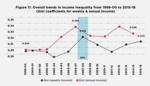
Gini (weekly income) Gini (annual income)
Figure 12 shows how average disposable household incomes grew for the five equal-sized income groups (or income quintiles) identified earlier. Average incomes grew from 2000 to 2008, but those of the highest 20%, and especially the highest 5%, grew much more strongly. After 2008, income growth was weak for the majority, while the incomes of the highest 20% and 5% at first declined and then recovered.
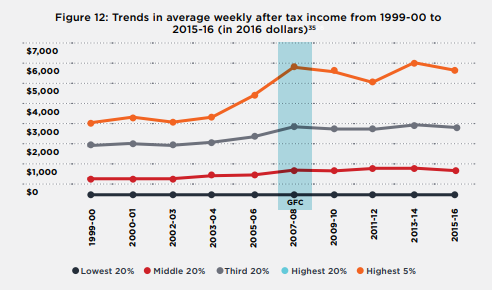
Household incomes rose strongly (and strongest at the top) before the GFC; but rose more slowly afterwards, with the highest 5% and lowest 10% receiving the largest increases overall.
Figure 13 shows more clearly how incomes changed between three years: 1999-2000, 2007-08 and 2015-16, by showing overall growth in the incomes of the different income groups as a proportion of their previous incomes36.
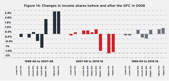
Between 1999-00 and 2007-08 (left side) after-tax incomes (adjusted for inflation) grew strongly but with increasing inequality, at an average rate of 3.4% per year for the lowest 20%, 3.6% for the middle 20%, 4.3% for the highest 20%, and a remarkable 6% a year for the highest 5%.
Between 2007-08 and 2015-16 (middle bars), income growth was much slower but the previous un-equalising trend was reversed37. Average household income rose by 1.2% per year on average for the lowest 20% (mainly due to a 2.7% increase for the lowest 10%), 0.1% for the middle, and 0.4% for the top 20%, but declined by 0.5% for the top 5%. The likely reason for the relatively large increase in incomes for the lowest 10% was an increase in pension payments in 2009, discussed later.
The overall effect (shown on the right) was stronger growth at the top and bottom of the income ladder (2.7% per year for the lowest 10% and highest 5%) and lower growth in between (1.8% per year for the middle and fourth 20%).
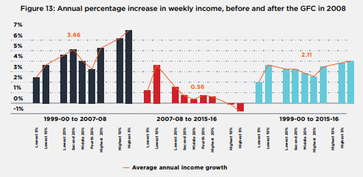
Overall household income shifted from lower to higher income households before the GFC and shifted back afterwards (though only partially).
The purchasing power benefits of income growth for those on the lowest incomes are more modest than they appear in Figure 13 because (for comparative purposes) income growth is measured relative to the previous level of income. For example, the average annual increase of 2.3% in the incomes of the lowest 20% from 1999-00 to 2015-16 amounted to just $8 per week.
Another way to illustrate these trends is to compare changes in each group’s share of overall household income over the two sub-periods (Figure 10).
From 1999-00 to 2007-08, income growth was skewed towards high income-earners, so that around 1.6% of household income ‘shifted’ from the lowest 80% to the highest 20%38. From 2008 to 2016, around 1.2% of household income ‘shifted back’ from the highest 20% to the lowest 80%.
35 Note that our analysis of trends in inequality from 1999-00 to 2015-16 uses a different income measure (adjusted to abstract from changes in income definitions used by the ABS during the period) to that used in our static analysis of inequality in 2015-16 (which use the latest ABS income measure). For more information on the approach taken, see Inequality in Australia: New estimates and recent trends research methodology for 2018 report).
36 Note that the ABS data used in this report do not track the same households over time, but compares the incomes of households who are in the same position of the income distribution in each year.
37 Figure 9 uses the ABS data for weekly incomes. As discussed, the ABS annual income data series yields higher estimates for overall inequality after 2007.
38 Actually, incomes grew for most households but grew fastest at the highest levels.
Lowest 20% Middle 20% Third 20% Highest 20% Highest 5%
The overall effect of these changes in income shares, shown on the right, was that around 0.7% of income ‘shifted’ from the middle and fourth 20% to the highest and second-lowest 20%, with the greatest gains (of 0.6%) enjoyed by the highest 5%. It is noteworthy that (in contrast to Figure 9) the share of the lowest 10% declined. This illustrates that the large percentage increases in the incomes of the lowest 10% noted above were small in absolute terms, and when compared with average gains overall.
Chapter 1 of the Supplementary Report explores some of the key factors contributing to inequality in 2015-16, and the increase in inequality from 1999-00 to 2015-16.


PART 2: WEALTH
WEALTH
This part reports on inequality of household wealth. Wealth inequality is important because wealth influences many of the opportunities available to people – for example, whether to invest in further education (which influences employment outcomes) or to purchase assets that can generate a future income stream, such as shares or investment properties.
The OECD argues that because wealth contributes to future income, high wealth inequality can entrench income inequality. For this reason, and because wealth may be locked up in unproductive assets, high concentrations of wealth can also constrain future economic growth39.
Wealth also provides financial security for times when income is reduced, especially after retirement but also during working life when people become ill, lose their job, or take time away from paid work to care for family members.
Net wealth comprises:
- Assets: the residential home, other real estate, other physical assets (e.g. home contents, vehicle) and financial assets including loans to others, bonds, superannuation, bank accounts, shares, trusts, and business assets;
minus
- Liabilities: including mortgage and other debt (e.g. student loans)40.
Note on measuring wealth inequality
Unlike the income section of the report, we do not apply an equivalence scale to adjust household wealth. This is because wealth held by a household will generally be used to finance consumption in the future when the size and make-up of the household may be different. For consistency with this, we place the same number of households into each wealth group/quantile (rather than the same number of individuals as in the income part of this report).
These are not the same income groups used for our income distribution analysis. In this chapter we divide households according to income into equally sized household groups, rather than dividing individuals into equally sized groups according to the income of their households (as in Part 1). This makes a difference because households come in different sizes.
39 OECD (2015): Op cit; Piketty T (2014) : Op cit.
40 To calculate net wealth, we deduct liabilities from assets within each asset class (e.g. own home mortgage is deducted from residential home wealth). There is a residual ‘other debt’ category comprising student loans and credit card debt.
In this part we look at the distribution of wealth and examine trends from 2003 to 201641. There are two ways of looking at the distribution of wealth. The first method ranks households by the amount of wealth that they have. This shows the concentration of wealth across the population. The second method ranks households according to their income and then examines the wealth holdings of groups of these households. Both approaches are used in this report.
In 2016 Australia’s average net wealth per household (after subtracting associated debt) was $936,000. The high average figure for asset holdings is due in part to the substantial wealth of a rich minority. For example, in 2017, there were 3,000 Australians with $US50 million or more. Of all household net wealth, 39% was owner-occupied housing, 20% was superannuation assets, 19% was shares and other financial assets, 12% was other (investment) real estate, and 10% comprised other non-financial assets such as cars (Figure 15).
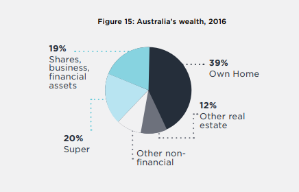
Figure 15 shows that a large component of Australia’s household wealth is held in the family home (39% of total wealth), followed by 19% in financial assets like shares and business, and 20% in superannuation. Around 12% is held in other real estate (investment properties) and 10% in other non-financial assets (e.g. vehicles and home contents). All values are net of associated debt.
41 ABS data on the distribution of wealth has only been available since 2003.
2.1 The distribution of wealth today
Key points
- In 2016 Australia’s average net wealth (after debt is subtracted) per household was $936,000. Of this, 39% was the main home, 20% was superannuation, 19% was shares and other financial assets, 12% was investment real estate, and 10% was other non-financial assets such as cars.
- Wealth is far more unequally distributed than income. The average wealth of a household in the wealthiest 20% ($2.9 million) is five times that of the middle 20% ($570,000) and almost a hundred times that of the lowest 20% ($30,000). The wealthiest 5% had average wealth of $6 million and the wealth of the highest 1% averaged $14 million.
- The wealthiest 20% of households own 62% of all wealth, while the lowest 50% own just 18%.
- Ownership of some asset classes is even more concentrated. The wealthiest 20% own over 80% of all investment property and shares and over 60% of all superannuation assets. In contrast, they own 54% of all wealth in family homes.
- Wealth is more evenly distributed across income groups, largely due to high levels of home ownership among retirees, who are more likely to have low incomes.
- The highest 20% of households by income had an average wealth of $1,952,000, almost three times the middle 20% ($711,000) and almost four times the lowest 20% ($532,000). The highest 5% had average wealth of $3,730,000.
- The highest 20% income group held 30% of all household wealth in owner-occupied housing, compared with 17% for the middle 20% and 16% for the lowest 20%.
- Other forms of wealth are much less evenly distributed among household income groups. The top 20% owns 60% of all shares and other financial assets, 53% of investment real estate, and 46% of superannuation wealth.
Wealth is far less equally distributed than income
Figure 16 shows that wealth is far more unequally distributed than income. The highest 20% of households hold 62% of all wealth. The middle 20% holds 12%, and the lowest 20% holds less than 1%.
Wealth is highly concentrated at the very top. The highest 10% wealth group owns 45% while the highest 5% owns 32% and the very highest 1% holds 15%42. So the share of the highest 1% (15%) is almost as large as the combined share of the next 4% (17%), which in turn is larger than the combined share of the next 5% (13%)43.
42 Credit Suisse Research Institute (2017): Op cit
43 This probably underestimates of the true extent of wealth inequality. The wealthiest 1%, who own a disproportionate share of all wealth, are a small number of people and so are underrepresented in household surveys.
In contrast, the combined wealth of the lowest 40% is just 6% of the total.
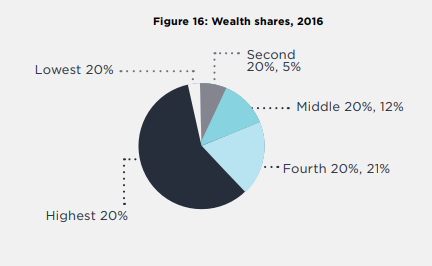
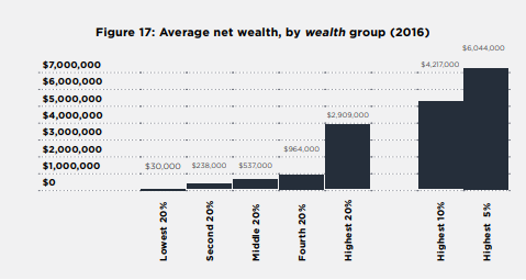
Figure 17 compares the average wealth of different households. The highest 20% had average wealth holdings of $2.9 million, more than five times that of the middle 20% ($537,000) and almost 100 times the $30,000 held by the lowest 20%. The average wealth holdings of the highest 1% were $14 million.
Note: We do not apply an equivalence scale to adjust household wealth. In Figures 28-30, the same number of households is placed in each wealth group (rather than the same number of individuals as in the income part of this report).
The wealthiest households are more likely to have substantial share-holdings, investment properties, and superannuation, while the poorest usually do not own their home.
The composition of wealth differs markedly across wealth groups. Figure 29 shows that most of the wealth of the lowest 20% comprises low-value assets like vehicles and home contents (49%), and to a lesser extent superannuation (40%). The average net value of owner-occupied housing held by this group is just $2,000, which strongly suggests that the majority do not own (or are purchasing) the home in which they live44.
They have significant net liabilities for investment property (averaging $12,000), which are probably related to a common tax avoidance practice called ‘’negative gearing”.
For those in the middle 20%, most wealth is held in the main residence (53%), with less in other non-financial assets such as cars (17%) and superannuation (8%) than the lowest 20%. Less than half of the wealth of the top 20% is in the residential home (34%), with greater amounts held in shares and other financial assets (24%) and investment property (16%) than the other groups.
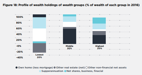
Note: Since these are net wealth holdings (asset values minus associated debt), values may be negative (as is the case for investment property held by the lowest 20%) and overall shares of net wealth may exceed 100%. For ease of interpretation, the shares of own-home, superannuation, shares, and other assets have been adjusted so that they add up to 100% in the left hand bar (lowest 20%). This alters the proportions slightly when we compare the (negative) value of net investment property holdings with the values of holdings other asset classes.
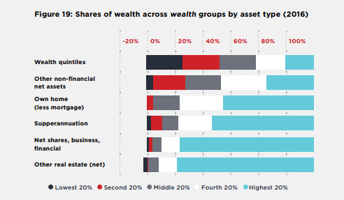
The ownership of shares, investment real estate and superannuation is highly concentrated. The highest 20% of the wealth distribution owns over 80% of all wealth in investment properties and shares and 60% of all superannuation wealth (Figure 19). Household wealth in the residential home is more evenly distributed (though the highest 20% holds 54%), with the most evenly distributed asset type being other non-financial assets (e.g. vehicles and home contents), reflecting the fact that households across the distribution are likely to own these assets.
Wealth is distributed differently by income group, but still more unequally than income
Wealth is more evenly distributed across income groups, due in part to high levels of home ownership among retirees, who are more likely to have low incomes.
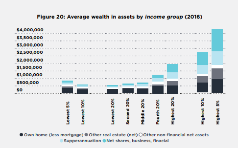
Figure 20 shows that the highest 20% of households ranked by disposable (but not equivalised) income had average wealth of $1,952,000, almost three times the middle 20% ($711,000) and almost four times the lowest 20% ($532,000). The highest 10% had average wealth of $2,676,000 and the highest 5% had $3,730,000.
The main residence of the highest 20% by income had an average net value (after mortgage debt is subtracted) of $557,000 which was 1.7 times that of the middle 20% ($319,000) and 1.8 times that of the lowest 20% ($302,000).
Note: In Figures 18 and 19, wealth is calculated on a per-household basis (i.e. with equal numbers of households in each income quintile group). To place households in the income groups (as distinct from the wealth groups in Figures 20 and 21), income is adjusted by the equivalence scale.
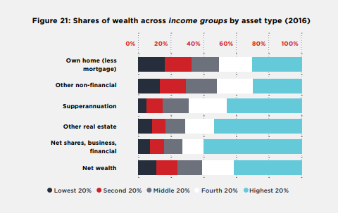
Figure 21 compares the share of wealth held in different assets across income groups. It shows that the highest 20% of income groups held 30% of all net wealth in main residences, compared with 17% for the middle 20% and 16% for the lowest 20%. The relatively equal distribution of owner-occupied housing wealth across household income groups is a legacy of the high home ownership rate among older people (who tend to have lower incomes). This is likely to change in future as a growing share of new cohorts of older people do not own their main home (or still have substantial mortgage debt)45.
Other forms of wealth are much less evenly distributed. The highest 20% income group owns 60% of all shares and other financial assets, 53% of investment real estate, and 46% of superannuation wealth.
44 Note that this is the lowest 20% of households by wealth, not income.
45 Yates (2015): Trends in home ownership: causes, consequences and solutions Submission to the Senate Standing Committee on Economics Inquiry into Home Ownership, Parliament House, Canberra.
2.2 Wealth inequality in Australia compared with other countries
Comparing wealth distributions across countries is difficult due to different methods in valuing household wealth. A recent OECD report found that in 2010 Australia’s wealth distribution was more equal than the OECD average. Whereas the highest 10% of households by wealth owned 50% of wealth on average across the OECD, in Australia the highest 10% owned 45% of wealth46. However, the OECD average was skewed upwards by the United States, which had very high wealth inequality.
Figure 22 updates those estimates for the share of household wealth held by the highest 10% and lowest 60% of households by wealth in 2014, suggesting that wealth was less unequally distributed in Australia than on average throughout the OECD.
The high share of Australian household wealth held in owner-occupied housing (39% of all household assets by value) which is less unequally distributed than other asset classes such as superannuation, investment property and shares, is one likely reason for this.
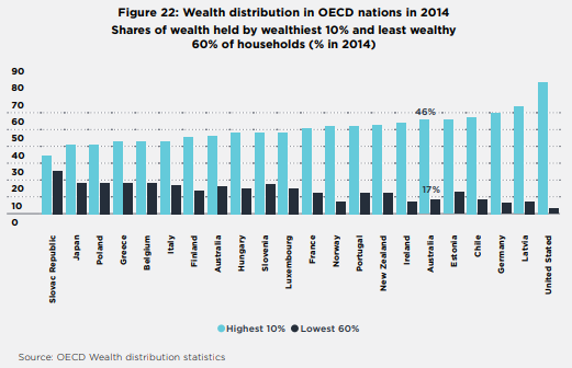
Note: Data for Estonia, Finland, Ireland, Portugal and the United States are for 2013.
46 Murtin F & and d’Ercole M (2015): Household wealth inequality across OECD countries: new OECD evidence OECD Statistics Brief No. 21, Paris.
2.3 Trends in the distribution of wealth
Key points
- Average household wealth rose strongly from $644,000 in 2003-04 to $836,000 in 2009-10, fell to $802,000 in 2011-12 (after the GFC), and rose again to $936,000 in 2015-1647.
- The fastest-growing asset classes by value were superannuation (which grew by 119%), and investment property (61%), reflecting regular contributions and generous tax treatment for superannuation, as well as a property boom.
- Over the 12 years to 2016, wealth inequality increased, though there was some levelling off after the GFC in 2008. The Gini coefficient for household wealth rose from 0.57 in 2004 to 0.60 in 2009, fell back to 0.59 in 2011, and then rose again to 0.61 in 2016.
- The average wealth of the highest 20% rose by 53% (to $2.9 million) from 2003 to 2016, while that of the middle 20% rose by 32% and for lowest 20% declined by 9%. The wealth of the wealthiest 5% grew even more rapidly, by 60% over this 12-year period.
- The highest 20% increased its share of all wealth by 3.2 percentage points. The shares of all other groups declined, with the greatest reduction in wealth shares experienced by the middle 20%.
Changes in the value and distribution of superannuation and investment property holdings were the main drivers of increases in wealth inequality between 2003-04 and 2015-16:
- The largest asset classes by total value were owner-occupied housing and superannuation, while the assets distributed most unequally were holdings in trusts, investment property and shares.
- The main contributors to growth in wealth inequality from 2004 to 2016 were superannuation (whose contribution to the Gini coefficient for wealth rose by 0.04) and investment property (whose contribution rose by 0.02). This reflects relatively strong growth in the overall value of those assets, together with their heavy concentration among wealthier households.
Wealth shifted to older households and became more unequal among younger households:
- Household wealth shifted to older groups from 2003 to 2015. The average wealth of households with a reference person aged over 64 years grew by 57% from 2004 to 2016 (to $1.3 million) and by 36% (to $1.2 million) for those with a reference person aged 45-64 years, compared with 28% (to $700,000) for those with a reference person aged 35-44 years and 22% (to $300,000) for those with a reference person aged 35 years.
- Wealth inequality increased most strongly among younger groups (under 35 years). The Gini coefficient for the distribution of wealth within these households rose from 0.58 to 0.65 (compared to 0.57 to 0.61 for all households). This was mainly due to rapid growth in the average value of shares, financial and business assets and investment property held by young households (possibly due in part to reduced access to home ownership) together with increased concentration of these assets in wealthier households within the youngest age group.
- The average holdings of owner-occupied housing among the under-35 group (net of mortgage debt) declined from $90,000 to $85,000. In contrast, the average value (net of debt) of the home for over 64s rose by 37% from $402,000 to $509,000.
Average wealth increased up to the GFC, declined, then rose again.
On average, the net wealth of Australian households (derived by subtracting debt from asset holdings) grew rapidly in boom conditions from $644,000 in 2004 to $836,000 in 2010. Average net wealth declined after the GFC, falling to $802,000 in 2012, then rose again to $936,000 in 2016.
Wealth inequality followed a similar pattern to income inequality, finishing at a higher level in 2016.
Wealth inequality increased from 2004 to 2008 (the Gini coefficient rose from 0.57 to 0.6), fell slightly after the GFC (to 0.59 in 2012), then rose again (to 0.61) in 2016 (Figure 24).
Figure 23 also shows the contribution of different components of household wealth (asset classes) to overall wealth inequality. The three asset classes making the greatest contributions to wealth inequality at the end of the period in 2016 (when the Gini coefficient was 0.61) were owner-occupied housing (contributing 0.22, reflecting its high weight among household assets), shares and business income (contributing 0.15, reflecting its high concentration in high-wealth households), and superannuation (contributing 0.12, reflecting its high weight among household assets)48.
47 Note that (unlike for income inequality) consistent data on trends in household wealth inequality are only available from 2003-04 to 2015-16. This trend analysis focuses on the distribution of wealth among household wealth groups rather than income groups. All values are in 2015-16 dollars.
48 It doesn’t follow that these asset classes were mainly responsible for growth in wealth inequality over the period. Trends in the ‘weight’ and ‘concentration’ of different asset classes are discussed later.
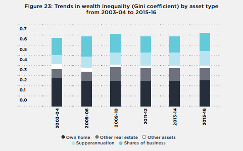
Note: This graph shows the contribution of each asset class to overall wealth inequality. The sum of these contributions is the Gini coefficient for each year, which rose from 0.57 in 2003-04 to 0.61 in 2015-16.
Trends in wealth inequality were driven mainly by the wealthiest 20%
The main factor contributing to higher wealth inequality over the period was strong growth in average wealth holdings of high-wealth households, though this was more volatile than for middle and low-wealth households (Figure 24).
The average wealth of the highest 20% rose from $1.9 million in 2004 to $2.6 million in 2010, declined to $2.4 million in 2012 and rose again to $2.9 million in 2016. Trends in the value of wealth holdings of the remaining 80% were much less volatile.
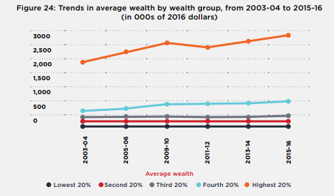
Figure 25 shows that over the whole period from 2004 to 2016, the average wealth of the highest 5% rose by 60%, the highest 10% by 56%, and the highest 20% by 53%. This was well above the increase experienced by the middle 20% of wealth-holders (32%). In sharp contrast, the average wealth of the lowest 20% declined by 9%.
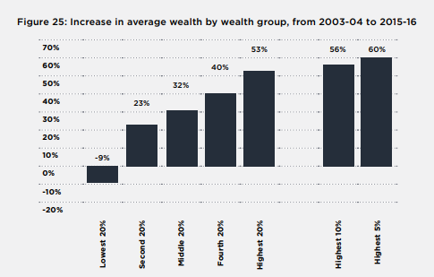
The highest 20% increased its share of overall wealth as against all other groups
Figure 26 shows that, as a result of the above trends, the highest 20% of households by wealth increased their share of all household wealth by 3.2 percentage points, while the share of all other groups declined. This represents an unambiguous increase in wealth inequality.
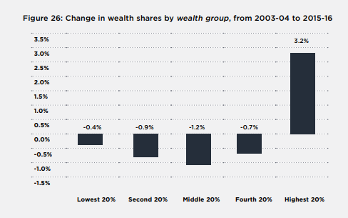
Changes in wealth inequality are a product of changes in the weight (relative value) of each asset type and changes in the concentration of different assets (towards higher or lower wealth groups)
Different asset classes contributed in different ways to the growth in wealth inequality observed above. We can break this growth in wealth inequality into two components:
- changes in the relative size or ‘weight’ of different asset classes;
- changes in the ‘concentration’ of each asset class (the degree to which holdings were concentrated at the top end of the distribution).
The fastest growing household assets by overall value were superannuation and investment housing
Figure 27 shows that the average value of owner-occupied housing net of mortgage debt (the largest component of household wealth) rose strongly before the GFC, declined between 2010 and 2012, and then resumed its strong growth. It posted an overall increase in value of 28% throughout this period.
Investment in real estate and shares and business assets followed a similar pattern, but their value increased much more sharply. The average value of superannuation holdings grew consistently across the period (by 119% overall), so that its share of wealth holdings increased49. The second-fastest growing asset by value (growing by 61%) was investment housing, reflecting an investment housing boom over much of the period50.
From 2004 to 2016, the share of owner-occupied housing wealth in all household wealth fell from 45% to 39%, though it remained the largest component. The share of wealth in superannuation rose from 14% to 20% (reflecting the gradual maturing of the superannuation scheme), while that of shares and business assets rose from 18% to 19%. The share of investment property assets in household wealth rose from 11% to 12%.
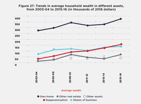
Note: ‘own home’ includes value of own home offset by mortgage debt, plus other non-financial assets (e.g. cars); ‘shares, business’ includes bonds.
49 This strong growth was due to a combination of regular compulsory contributions, its generous tax treatment, and a tendency for wealthy older people to shift other assets into superannuation to take advantage of tax concessions (Daley J & Coates B (2015): ‘Super tax targeting Grattan Institute, Melbourne).
50 The investor share of borrowings for housing (as against borrowing for owner-occupation) rose substantially (Reserve Bank of Australia (2016): Statement on Monetary Policy – August 2016).
 Wealth held in trusts, investment properties and shares is very unequally distributed
Figure 28 compares trends in the concentration of wealth held in different forms, using a ‘concentration index’ (explained in detail in Inequality in Australia: New estimates and
recent trends: Research methodology for 2018 report). Wealth held in own-business assets (with an index value of 0.9 in 2016, up from 0.88 in 2003), trusts (0.89, up from 0.81), investment properties (0.81, up from 0.77) and shares and bonds (0.8, up from 0.78) were the most unequally distributed household assets throughout the period51.26 Among these asset classes, inequality in the distribution of wealth held in trusts and investment property increased the most sharply.
To illustrate this in a different way, in 2016 the richest 5% held 58% of investment property by value and 52% of shares and other financial and business assets (including trusts), compared with 32% of overall household wealth. In contrast those households held 29% of all superannuation wealth and 20% of the value of owner-occupied housing.
Owner-occupied housing was much more equally distributed than financial assets, with a concentration coefficient that rose from 0.46 in 2003 to 0.47 in 2016, while superannuation occupied an intermediate position with a value that rose from 0.56 to 0.57.
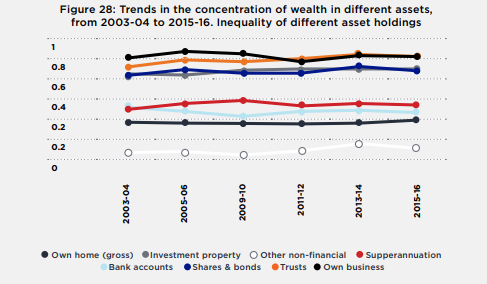
Note: ‘Concentration’ is measured here using a concentration coefficient, similar to the Gini coefficient, where a value of 0 represents complete equality and 1 represents complete inequality. The concentration coefficient for a wealth component (e.g. own home) is defined similarly to the Gini coefficient for that component, except that people are ranked by total wealth rather than by each wealth component. This enables us to measure the contribution of each component to overall wealth inequality, measured using the Gini coefficient (for example, in Figure 24).
In this analysis, ‘own home’ is exclusive of mortgage debt.
The main contributors to overall growth in wealth inequality were superannuation, investment property, and shares and other financial assets
Returning to Figure 28 (above), when we combine the above data on changes in the relative weight and concentration of different asset classes over the period, we find that the main contributors to growth in wealth inequality over the period (the increase in the Gini coefficient for wealth from 0.57 To 0.61 noted previously) were superannuation (whose overall contribution to the Gini coefficient rose from 0.08 to 0.12) investment property (whose contribution rose from 0.08 to 0.10), and shares and other financial assets (whose contribution rose from 0.14 to 0.15)52. As discussed, this was due to varying degrees to a combination of their growing share of total household wealth and their growing concentration towards the top of the distribution53.27
The tax treatment of investment income spurs growth in wealth inequality
As in other wealthy nations, in Australia’s personal income tax system, investment assets are taxed concessionally compared with wages54. These tax concessions range from the non-taxation of capital gains from owner-occupied housing to a 50% tax discount for personal capital gains from sale of investment property or shares, ‘negative gearing’ arrangements where losses from investment properties can be offset against other income, and the generous tax treatment of superannuation (where contributions and fund earnings are often taxed at a flat rate of 15%, or not at all).
These different tax treatments of investment income are shown in Figure 29, which shows the effect of tax concessions on hypothetical investments by a high income-earner in different assets held over a seven-year period based on 2008 tax rules. The income tax treatment of interest from bank accounts and bonds (the first bar on the left) is similar to that of earnings received by a high income-earner (a personal tax rate of 47%). All other investments were taxed more lightly55.
51 Note that in Figure 30, a more detailed breakdown of asset classes is provided. The ‘shares and other financial assets’ class is broken down into assets held in trusts, shares, bonds, and bank accounts.
52 The increases in wealth inequality attributed to these assets were partly offset by reductions in the contribution of own-home wealth and other non-financial assets, due to their declining share of overall wealth.
53 Superannuation was less unequally distributed than investment housing and some other assets (including shares) throughout the period, but it is the change in concentration over the period that concerns us here.
54 Australia’s Future Tax System Panel (2008): Architecture of the Australian tax-transfer system The Treasury, Canberra; Piketty T (2012): Op cit.
55 Since 2008, there have been significant changes to the tax treatment of superannuation, and to personal tax scales, but the overall picture is not fundamentally changed.
Own home (gross) Investment property Other non-financial Supperannuation
Bank accounts Shares & bonds Trusts Own business
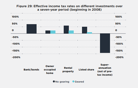
Source: Australia’s Future Tax System Panel (2008): Architecture of the Australian tax-transfer system, The Treasury, Canberra56.
The concessional tax treatment of the main forms of investment income assists taxpayers to grow their wealth in assets such as superannuation and negatively-geared property investments. Since these tax concessions are generally regressive (benefiting high-income earners more than low income-earners per dollar invested), and the resulting wealth is very unequally distributed (especially in the case of shares and investment property), these tax concessions contribute to growth in wealth inequality57.
Wealth is increasingly concentrated in older households
Between 2004 and 2016, the average wealth held by households with a reference person aged 65 years and over grew by 57% to an average of $1.3 million, the highest for any age group. Their average wealth grew much faster than for households with a reference person aged 45-64 (which grew by 36% to $1.2 million), those with a reference person aged 35-44 (which grew by 28% to $700,000), and those with a reference person aged under 35 years (which grew by 22% to $300,000).
A rise of $466,000 in the average wealth of the 65-plus group came almost entirely from superannuation (which rose by $166,000), followed by owner-occupied housing (up by $147,000), shares (up by $70,000) and investment property (up by $65,000).
Inequality among younger households increased strongly, as many found it harder to buy a home
From 2003 to 2016, wealth inequality increased most strongly among households with a reference person aged under 35 years. The Gini coefficient for the distribution of wealth within these households increased from 0.58 to 0.65 (compared to 0.57 to 0.61 for all households). This was mainly due to a shift in their asset holdings away from home ownership and towards shares, financial and business assets (up from 11% to 22% of total assets) and investment property (from 11% to 13% of total assets). At the same time, these ‘rising’ asset classes became more concentrated in wealthy younger households.
Over the same period, the average value of owner-occupied housing among households with a reference person aged under 35 years declined from $90,000 to $85,000 (net of mortgage debt)59. 27
All things being equal, growth in wealth inequality among younger households suggests that wealth inequality is likely to continue to increase, especially if home ownership rates among younger cohorts continue to decline.
56 Assumptions: Calculated for an individual taxpayer on a 46.5 per cent marginal tax rate. Assets held for seven years. Inflation 2.5 per cent, 6 per cent nominal return. Gearing 70 per cent — not applicable to bank/bonds and superannuation. Tax on debt providers is disregarded. For property, 70 per cent of the return is attributable to capital gains and 30 per cent to rent. A 3 per cent conveyancing duty is assumed on the acquisition value, and annual rates are applied at 0.6 per cent of the value. Land tax applies to rental property at the same rate as annual rates. The ‘listed share’ is a company holding an asset taxed on an accruals basis. The company retains 50 per cent of its profits each year. There is no duty on the purchase or sale of the listed share and accrued franking credits are assumed to be fully valued by the market. For superannuation, the taxpayer makes a one-off contribution at the beginning of the period out of pre-tax income and is eligible for a tax-free payout at the end of seven years.
57 ACOSS (2015): Fuel on the fire: negative gearing, capital gains tax & housing affordability, Tax Talks 2, ACOSS, Sydney; ACOSS (2015): Reform of the taxation of superannuation ACOSS, Sydney.
58 See also Daley J & Wood D (2015): The wealth of generations Grattan Institute, Melbourrne.
59 See also Wilkins R (2017): The Household, Income, and Labour Dynamics survey in Australia, Selected findings from waves 1 to 15 Melbourne Institute.
No gearing Geared